Does Architecture Matter?
Functional buildings leave lasting impressions. And to live and work in a structure that affords and adapts to your needs is not only delightful but desirable. These buildings shape us towards more creative behaviors, healthy habits, and innovative mindsets. Architecture matters only when, in its best possible form, it’s not an ego-driven mark on our landscape but a highly functional tool for human endeavors.
When a detail as minor as how to open a door needs explaining, technology, money, or fashion was dictating architectural decisions. These principals do not prioritize people’s needs; they value recognition. That being said, designers were not always focused on fame or money. The first architects were craft people engaged in trial and error; driven by a basic need for shelter and security, they developed a sense of what worked and what didn’t. Soon, they could replicate their knowledge and pass it on to future generations, creating a more complex design sensibility as the world grew and technology evolved. With this ever-growing complexity encompassing architecture, many practitioners lost recognition of what architecture was about: people.
For some architects, being people-focused is of great importance, and they craft buildings that function and mature like good wine. A building can be “plain” or not much to look at, but still be extremely useful to its occupants. Building 20 at MIT was regarded as temporary (and ugly)—hastily constructed in 1943 to provide space for research during WWII. From a bird’s-eye view, the building looked like a reversed “E” with an extra arm. It had four parallel “wings” connected to an extended spine. The three floors were wood construction, with a flat roof, and the ground level was a concrete slab. The exterior used asbestos-cement shingles, painted dirty white to reduce solar heat load. Some window-mounted air conditioners used in rattling wooden sash windows were intended to keep the heat down in the summer months.

Building 20 Image Credits MIT
Steward Brand, a writer and editor, would later call buildings like this “low-road,” cheap, provisional, improvised, and easy to reconfigure. The inhabitants of Building 20 felt free to modify it, abusing it in ways not tolerated in a “beautiful” building. Because of this, it became an “incubator” space accommodating innovative research, including radar, a tool used to win the war. In 1998, it was demolished, but not without speeches and celebrations of its functional history.
In a weird twist of irony, what replaced Building 20 in 2004 was the Strata Center, a building that undermines the importance of architecture. Designed by Frank Gehry, whose work has been described as a whimsical mesh of the modern and quirky, tilting, angled, and playful. Architecture described as defying categorization has nothing to do with function and everything to do with recognition, fame, technology, and aesthetics. This is a ‘beautiful' building, not a functional tool for human endeavors. Building 20 rejected the need for novelty and invention; the Strata Center did not.
 MIT Strata Center Built on the former site of Building 20
Considering an Interior Space
I’m distracted when I walk through my lobby because familiarity blunts attention, an idea Walter Benjamin argued before phones became an extra appendage. The entry for me is almost a non-place, a space of transience where I remain (almost) anonymous; the area blurs my perceptions, is this home, possibly, but it’s shared with the many others that live here? Is it private or public? The lack of definition and significance heightens the sense of ambiguity each time I arrive. It’s a tangible pathway that leads me to the comforts of home. But I wonder if the lobby is a wasted space. What occurs when I’m not here? Does it ever become a space for play or socializing? What am I missing? Should I start hanging out in the lobby?
As lobbies go, it’s nice. It has the same affordances as others: mailboxes, doors, windows, a coffee machine, and a gas fireplace. Arriving home, I move through double doors at the street entrance into a space with triple-height ceilings; the floors combine diagonal white stone tiles with black accents. To my left, two facing couches are set with puffy pillows, and a tall black mantel surrounds the fireplace. I am never enticed to sit on my way in. However, when puttering around or leaving, I think, “Oh, fireplace, that looks cozy,” wishing others were gathered for a chat. Making my way to the elevator, I have to walk up three wall-to-wall steps through a threshold framed in black. This is a narrower, rectangular room with lower ceilings. I am always drawn to the door at the opposite end, possibly because I can see trees and green…which is lacking in this lobby. Within this slim volume is a large desk and adjacent rooms for packages, mail, and elevators. An additional couch with two chairs provides more space to sit or not sit. The whole expanse is exceptionally well-lit, and there is a bit of the mundane.
Writing this essay helped me see and develop an awareness that triumphs over the humdrum of living. Living in my building and in this city, I’ve noticed that a building’s scale conceals its application. The lobby acts as a communication device, helping passers-by to determine what’s happening inside, revealing their use, business, or residential, hotel, gym, store, or other(?) or to-be-determined later. Lobbies speak a language of function. These functions can be useless; for example, there are no seats for waiting, one of the primary purposes of lobbies. Or their purpose could be to conceal nascent activity in plain sight. Speaking your native language doesn’t take much effort, just as my attentions are focused elsewhere in the functional monotony of my lobby. But that’s ok because this space, for me, is a node, a convergence point, and a junction where employees socialize, residents meet, and people wait. This space is not meant for me, for long-term loitering, but for chance encounters or utilitarian service. My lobby says, “Welcome home,” rather than “Stay, get comfortable.”
On View: Drucker Design Gallery
14th Veronica Rudge Green Prize in
Urban Design at the Graduate School of Design—Harvard University
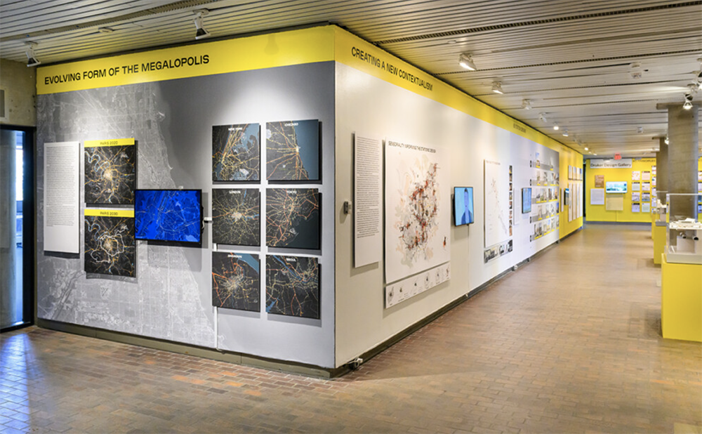
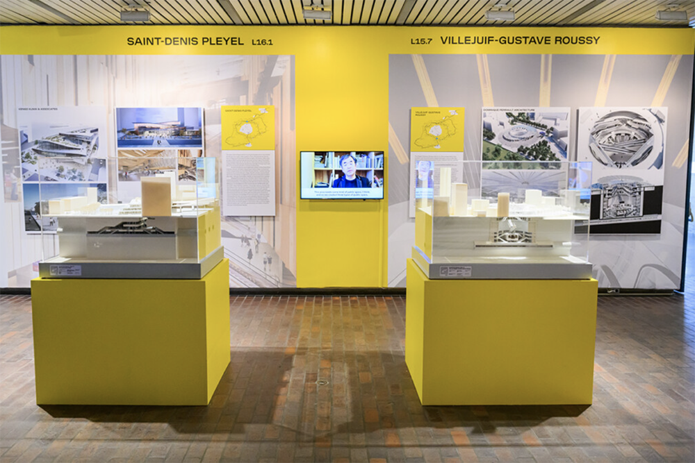
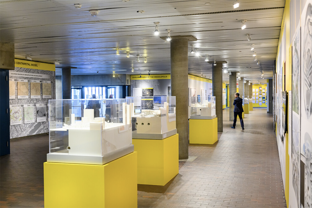
I genuinely believe in art and design exhibitions anywhere; I’ve organized many unconventional shows on beaches, in cars, in hallways, and even in a closet, to name a few. However, creating a cohesive, clear experience is challenging if the space is quirky. Harvard’s Drucker Gallery-essentially the building’s lobby-is an example of a challenging gallery space. And what is currently on view, the Grand Paris Express, led me to question whether this should even be called a Gallery.
I struggled with configuring the gallery itself. Located on the first floor of the design school, in what is essentially a sizeable transitional area between classrooms, the library, and the dining hall. Cave-like is how you could describe the space. It’s composed of two intersecting rectangles; viewed above, it would evoke a stubby letter, T. To see the exhibition, you must also compete with the carts and people, navigating the gallery with concentration, without glancing at your phone or talking to friends. In this state of awareness, I pulled together a vast amount of information into a logical whole.

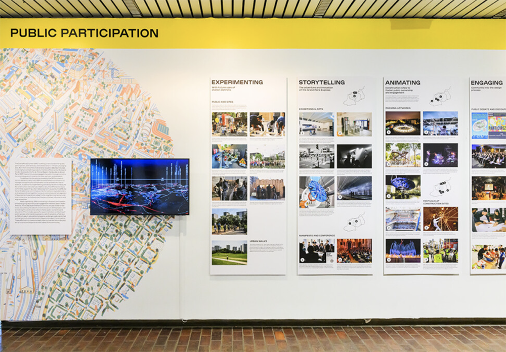
Images Courtesy of Drucker Design Gallery @ Harvard Graduate School of Design
Initiation into an experience starts with prompts that activate decisions. The yellow used in the exhibition is that initiation; it dominates the space, holding my gaze and adding cheer and light to the dark room. In this yellow embrace, I begin reading and reading and reading, becoming immersed. Circling the lobby, I take in each section and decide how to navigate because the information is segmented in a nonsensical manner; I crisscross the hall 3 or 4 times to glean what the Veronica Rudge Green Prize is even about (GSD identified exemplary projects in urban design)—such context as past winners (the High Line in New York City). In navigating the chaos, I noticed sloppy details, pixelated images, a lack of unit labels on a spider chart, titles that don’t follow a system, or simply too much information on a topic that didn’t warrant a whole wall.
Because there is no division between parts of the exhibition or a straightforward project developmental path to follow, my motion is arrested in detail. However, I realized that the details were key to making sense of the other sections. I conclude my visit with a better understanding of what the Grand Paris Express is (a large-scale transit project) and, in a bit of synchronicity, continue to read about the project in other journals I frequent.
Much of what designers do is invisible because it adds invaluable functionality and ease to our lives. And though the Grand Paris Express is a lauded project, something to learn from, I expected that same invisible, easy function from its curation. The Drucker Gallery is an atypical space for hanging and examining visual works. Yet it’s also a necessary space to feature important work and to engage in conversation about design; this site of experimentation plays a significant role in the school's pedagogical life.


